The Student Disability Resource Center (SDRC) is open during regular business hours, Monday-Friday, from 8:00am-5:00pm (except University Holidays and Closures, and periodic department training/in-service events). The SDRC may be reached at 951-827-3861 or sdrc@ucr.edu. To register for services, please visit this webpage. To request an appointment with a disability specialist, please go to the Appointment Request Form.
Accessible PowerPoint: Color and Contrast
Always convey information in a way that does not rely solely on color. For instance, stating in a form that, "required fields are in red" poses a problem to screen reader and color blind users. They will not be able to see which fields are required. Adding an asterisk to those same form fields and updating the notation to read, "required fields have an asterisk" helps not only screen reader and color blind users, but all users.
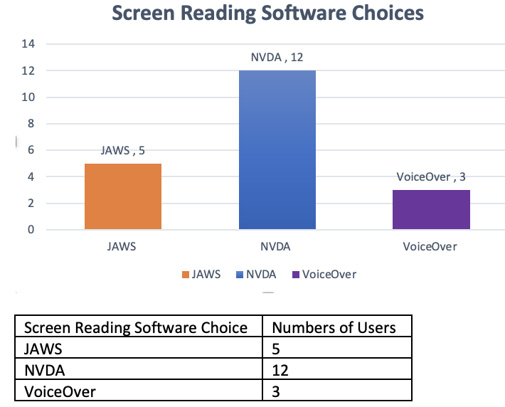
This same rule applies to information within graphs, charts, infographics and other images. For instance, if you were to share the following graph about screen reader software choices, do not use the statement, "NVDA users are listed in blue, JAWS users in orange and VoiceOver users in purple." Instead, convey the information within the text or have an alternative method of conveying the same information, like an accessible data table.

Color contrast is the difference in light between font (or anything in the foreground) and its background. In digital accessibility, how well one color stands out from another color determines whether or not most people will be able to read the information. The Web Content Accessibility Guidelines state that, "the visual representation of text and images of text has a contrast ratio of at least 4.5:1 except for the following: Large Text (with at least 18 point or 14 point bold), Incidental (text or images of text that are pure decoration or are part of a picture that contains significant other visual content), and Logotypes (text that is part of a logo or brand name)." To check contrast ratios, you will need to know the hex color codes of the colors being used and enter them into the WebAIM Color Contrast Checker.
